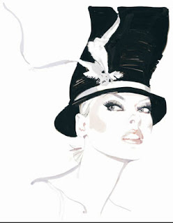
Digital Svetlana Makarova
Scanned as jpeg placed into Adobe illustrator CS3, my attempt to replicate Svetlana’s image using the same software she used
1: Collected base colors to work with these included:
- Gold for the crown and flesh tones for skin
- Magenta for the dress
- Dark Grey for leggings
- Pink for the lips
2: Using a working tablet I traced the image using a mixture of the pencil tool and pen tool in illustrator adjusted nodes to fit the shapes.
3: started to color the dark areas using adjustment with continuous use of the eye dropper to lift out different shades I used opacities of 30% to 100% sometimes one over the other to give transitions and strength when shading from light to dark an amazing ways of adding the shadow detail never the less the time constraint in the fashion industry due to building up of layers and different opacities would impact on the intensive use of this vector method.
- Crown used light yellow 60% opacity and 50% for the dark gold.
- Leggings from dark to light 40%opacities on dark grey used linear gradient on the knee cap used cyan to grey shades
- Flesh tones used a radical gradient of 44% on the cheekbones to create blush effect.
- Stars detail on the dress i used 70% opacity of light pink then reproduced them to layer and create a bright effect from the star as if it is shining this was the quickest method of duplicating them and dragging them to the area where they were to be placed.
- Lastly the dress a strange fuchsia pink I worked between light and dark starting with dark colors and finishing with light colors in order to easily see the contrast and shadows
Overall a very effective detail oriented way of illustrating but very time consuming


